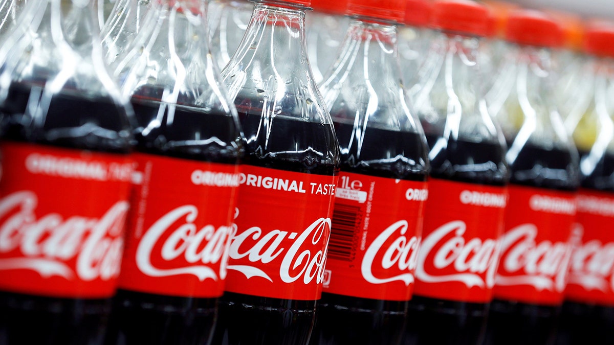
The soda used to be an alcoholic beverage. (Reuters)
Coca-Cola and the color red go together like peanut butter and jelly, milk and cookies, or tacos and Tuesdays. After all, we would recognize that iconic red label anywhere. But why did the company choose this shade for its logo in the first place?
Some claim that the red color came from one of the company’s first advertisements, which featured Santa wearing his famous red-and-white suit and holding a Coke bottle. But according to the Coca-Cola Company, its famous logo dates back to the very beginning of the brand itself. (You might be surprised by the quirky, secret messages hidden in famous company logos, too.)
More from Reader's Digest
Over 130 years ago, Coca-Cola was sold in barrels at American drug stores and pharmacies. Alcohol was distributed in the same way. But while alcohol was taxed at the time, soft drinks were not. So, the Coca-Cola Company began painting its barrels red in order to help customs and tax officials distinguish them from barrels of booze.
The shade stuck—and the rest is history. Now, “You see a red disc icon on a storefront, and you know that you’ll be able to get delicious, ice-cold Coca-Cola there,” Ted Ryan, a Coca-Cola archivist, said. “It became a promise in a way.”
You won’t find this beverage’s famous hue in any Pantone color registries, though; it is actually a combination of three different shades of red. The logo’s typography, on the other hand, is an official font. Called “Spencerian,” it has been associated with the brand since the 1900s.
That said, the Coca-Cola label hasn’t always looked the same as it does today. Find out what other famous company logos looked like when they were young.