(Microsoft)
NEW YORK – Microsoft is preparing an update to Windows 8 for release later this year. It says the changes are designed to address complaints and confusion with the new operating system.
Windows 8 is the most radical overhaul of Microsoft's operating system since Windows 95 came out nearly two decades ago. It was revamped to embrace the types of touch-screen controls popular on smartphones and tablet computers, devices that are siphoning sales from the desktop and laptop PCs that have been Microsoft's traditional stronghold. Windows 8 was released with much fanfare in October, but got a lukewarm reception from consumers.
Part of the problem is that Windows 8 tries to be all things to all people. It's designed to respond to touch-screen controls, but it also works with traditional mouse and keyboard commands. It offers a new layout that resembles tablet computers, but it also has a desktop mode that looks like previous versions of Windows. What results is confusion.
In addition, many of the controls to launch programs and change settings have been tucked away. That gives Windows 8 a cleaner look, but it also requires people to do more work finding all the controls.
Microsoft isn't saying much about what the new Windows 8 will have. Nor will it say whether it will charge for the upgrade. What the Redmond, Wash., company will say is that it's responding to customer feedback in developing the update.
- Windows through the ages: the history of the world’s most popular OS
- In pictures: Windows 8, Microsoft’s most radical OS yet
- Windows 8.1? Microsoft ‘Blue’ to address user gripes about Windows 8
- In tweets we trust … or not. Marc Andreessen, Peter Thiel debate tech industry
- Killer robots condemned in new UN report
Here's a look at some of that feedback and possible solutions in the coming update:
___
The problem: There's no central place for launching programs and changing settings.
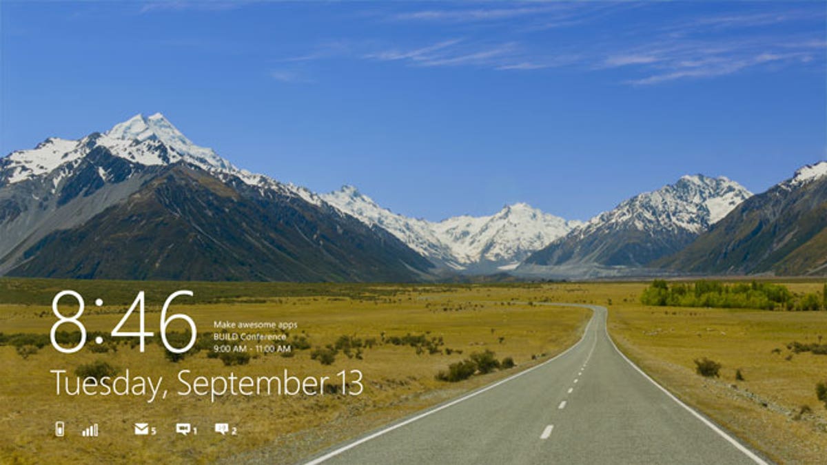
Windows 8 features a new start page that takes over the entire screen. The page is filled with boxes, or tiles, for accessing your favorite programs. But to get to programs you use less often, you need to slide up a menu from the bottom, click on "All apps" and find the one you want. When you're already using a program, such as a Web browser, you have to switch back to this start page to launch a different one, even if it's one of your favorites. To access settings, you need to slide over a set of icons, known as charms, from the right of the screen.
By contrast, past versions of Windows have a "start" button on the lower left corner, which allowed quick access to programs and settings without interrupting your workflow. That button is always there as you move from program to program.
The solution: Restore the "start" button. Don't make people figure out where everything is. Make it easy for them to see where to "start."
___
The problem: Microsoft is encouraging people to use the new tablet-style layout filled with tiles, but many programs are designed for the older, desktop mode. That's the case even with Microsoft's popular Office suite of business tools, despite the fact that the latest version of Office came out months after Windows 8 comes out.
As a result, using Windows 8 feels like running two different computers on the same machine, as the tile and desktop modes don't communicate well with each other. Consider Microsoft's Internet Explorer 10 browser. Web pages you open in desktop mode won't appear when you switch to the browser in the tile mode. Because many popular programs run only in desktop mode, it would make sense to do most of your computing there, but Windows 8 always forces you into tile mode when you start the machine.
The solution: Allow people to enter the desktop mode automatically when they start their machines. Over time, people may get more comfortable with tile mode and may want to switch, but don't force it on them and make them resent it before they are ready.
___
The problem: Those charms on the right are useful for restarting your machine, configuring your wireless connection and changing other settings. But you're left to figure out how to access them. On touch screens, you have to know to swipe a menu from the right, like opening a sock drawer. If you're using a mouse, you need to drag the cursor to the top or bottom right of the screen, then drag it to the appropriate charm.
The solution: Besides restoring the "start" button and having those settings instantly accessible, offer an option to have that sock drawer continually appear. It's similar to how the Taskbar is always present on older versions of Windows, usually at the bottom. It's also similar to how the Dock is always there on Mac computers (though once you're used to it, you can hide the Dock until you move your cursor there).
___
The problem: There's no obvious way to close programs, the way you can by hitting an "x'' at the corner of the program in older versions of Windows. You need to figure out how to drag the app to the bottom of the screen, and the way you do it depends on whether you are using touch or a mouse. Stray too far to the left or the right, and your computer will enter a multi-window mode instead.
The solution: Restore the "x." Don't force people to do gestures that don't seem intuitive to the task at hand.
___
The problem: In making it easy for touch screens, mouse and keyboard commands are more complex to use and figure out.
The solution: Don't try to be a one-size-fits-all operating system. Apple and Google have kept their systems separate for touch-screen mobile devices and for traditional computers that use mouse or trackpad controls.
Microsoft can improve usability by designing the operating system for one or the other. Don't expect this to change in the promised update, though.


